Wire's
Brand Identity
Wire’s Vision is to pioneer the secure digital exchange of ideas and information, ensuring trust and seamless connectivity for businesses and individuals worldwide.
Wire’s Mission is to help customers protect what matters by driving open innovation and
providing the most secure and easy-to-use collaboration platform.
Wire is simple and precise,
experienced, smart and approachable.
Wire’s messaging is contemporary and to the point, easy to understand and inviting.
Design Elements
Logo
The Wire logo features custom lettering designed collaboratively by Wire Design and illustrator Mads Burcharth. It spells out the name "Wire" and consistently represents the brand.
Typically, the logo is displayed in its entirety, featuring the full name. However, when space is constrained, it can be used in a condensed form as a symbol, highlighting the distinctive W.
The Wave
The wave is the central design element of Wire's brand. It originates from a stylized audio waveform that symbolizes a human voice, embodying the limitless potential for seamless communication through Wire. It conveys themes of connectivity, movement, and energy.
As the visual foundation of Wire's brand identity, the wave sets Wire apart and complements the logo effectively.
The wave is featured across all of Wire's marketing collaterals, including presentations, websites, print products, and social media channels.
Achieve:
- Start with the base wave element and find an interesting section that works in the context of the format and medium you are designing for.
- Aim for a similar composition and impression as depicted in the screens below.
- Convey the general sense of activity, movement and energy.
- Adjust the stroke width, positions and amplitude of each line to create a harmonious impression within the composition's context.
- If necessary, images can be positioned over the wave element. Harmonize the movement of the waves in the background with the image in the foreground to create a balanced look.
Avoid:
- Avoid magnifying individual lines excessively
- Avoid creating the impression of single curves instead of waves
- Do not use different colors
- Do not place text on the wave elements
- Do not use on backgrounds other than black
Base element
Formats & compositions
On light background
| Color | RGB | C/M/Y/K | Text |
Light Blue |
#0667C8 |
97/20/0/20 |
White |
Light Purple |
#8944AB |
62/80/0/00 |
White |
Light Green |
#1D7833 |
85/27/100/14 |
White |
Light Amber |
#A25915 |
27/66/100/21 |
White |
Light Red |
#C20013 |
16/100/100/6 |
White |
Light Petrol |
#01718E |
85/39/30/13 |
White |
On dark background
| Color | RGB | CMYK | Text |
Dark Blue |
#54A6FF |
75/28/0/0 |
Black |
Dark Purple |
#DA8FFF |
32/48/0/0 |
Black |
Dark Green |
#30DB5B |
71/0/87/0 |
Black |
Dark Amber |
#FFD426 |
0/14/88/0 |
Black |
Dark Red |
#FF7770 |
0/66/47/0 |
Black |
Dark Petrol |
#5DE6FF |
53/0/7/0 |
Black |
Typography
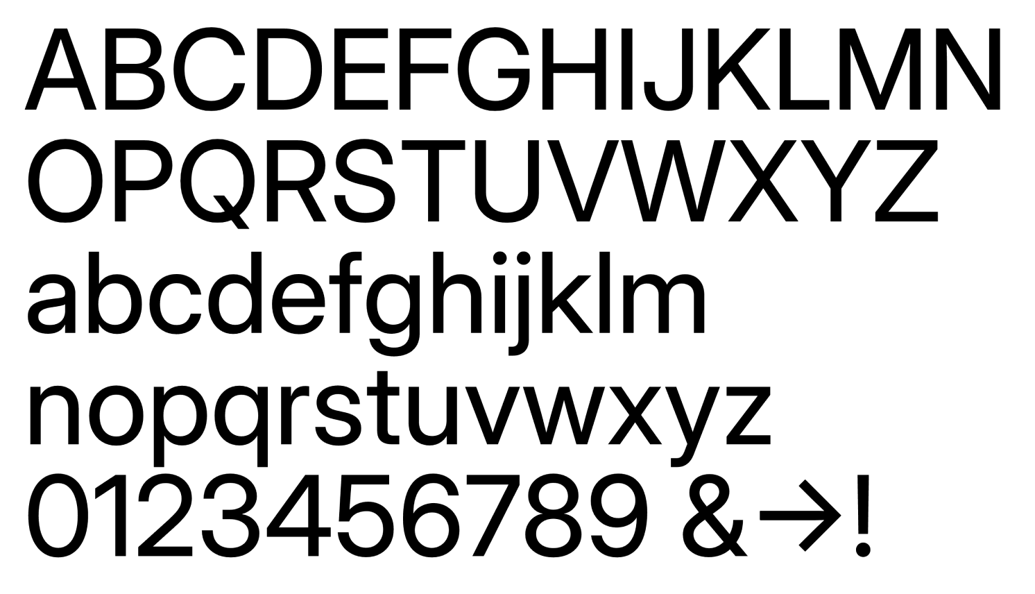
Wire utilizes the font "Inter" as its brand typeface. It conveys an inviting and approachable feel and is highly focused on readability.
You can download the font for free, with the option to install it as an additional font in Google Slides (learn more).
If "Inter" is unavailable, you can consider Roboto, Helvetica, or a sans-serif system font as a fallback.
-> Get Inter
Achieve:
- Aim for a contrast level of at least AA
- Use strong color contrast levels (black font on white backgrounds, white font on dark backgrounds)
Avoid:
- Avoid all capital letters
- Avoid rotated texts
Inter

| Usage | Weight |
| Body text | Regular (400) |
| Headlines, Sublines | Semi Bold (600) |
| Emphasis in body text | Bold (700) |
| Emphasis in headlines | Extra Bold (800) |
Achieve:
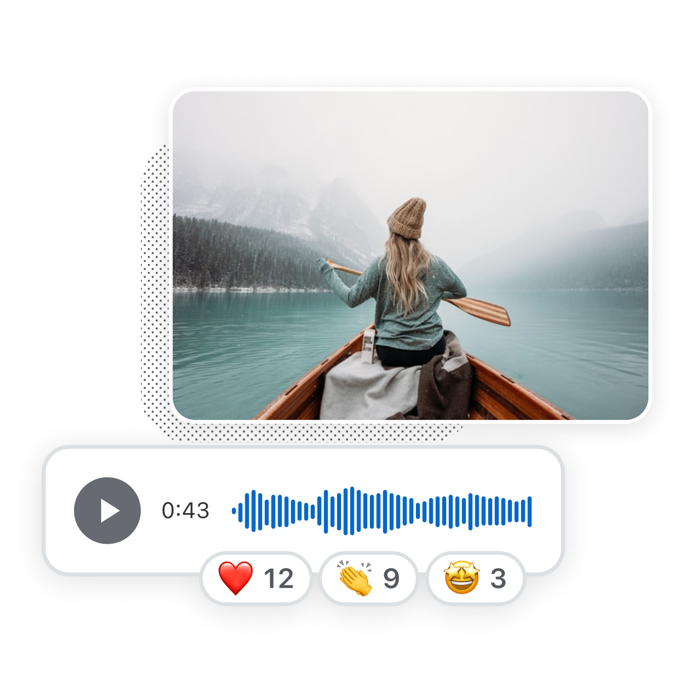
- Highlight people interacting with Wire in everyday environments
- Convey a friendly and approachable vibe
- Employ a warm and inviting color palette
- Feature faces when possible
- Opt for a square format with rounded corners if the layout allows it
Avoid:
- Avoid overused corporate clichés (e.g., all grey tones, stern older men in suits, mirrored skyscrapers)
- Avoid an unrealistic, glossy AI look
- Avoid fotomontages. If a subject is too intricate for a picture, consider using an illustration instead.


Illustrations
The illustration style of Wire complements its general tone of voice.
Achieve:
- Use illustrations to communicate complex aspects that are challenging to capture through photographs
- Incorporate stylized aspects of the Wire UI when suitable
- Aim for a simple and fun look and feel
Avoid:
- Avoid confusing, overcomplicated illustrations


Product Shots
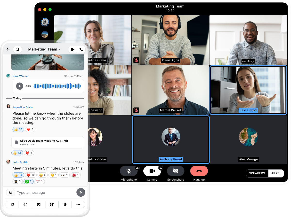
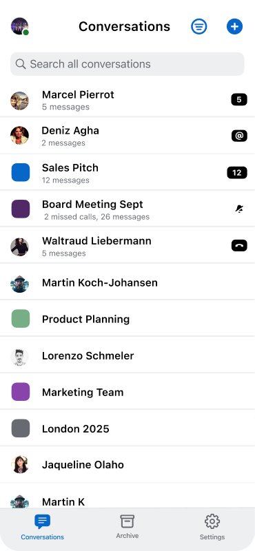
Images of the Wire App showcase specific features and details of the Wire application.
Achieve:
- Display a section of the Wire App relevant to the context.
- Coordinate with the Wire product design team if there is need for specific product shots.
- Utilize device-neutral frames (available in the product shot repository)
Avoid:
- Refrain from displaying particular device frames unless absolutely necessary.


Iconography
The icons in this set are custom made and designed to align with Wire's overall clear and inviting messaging.
