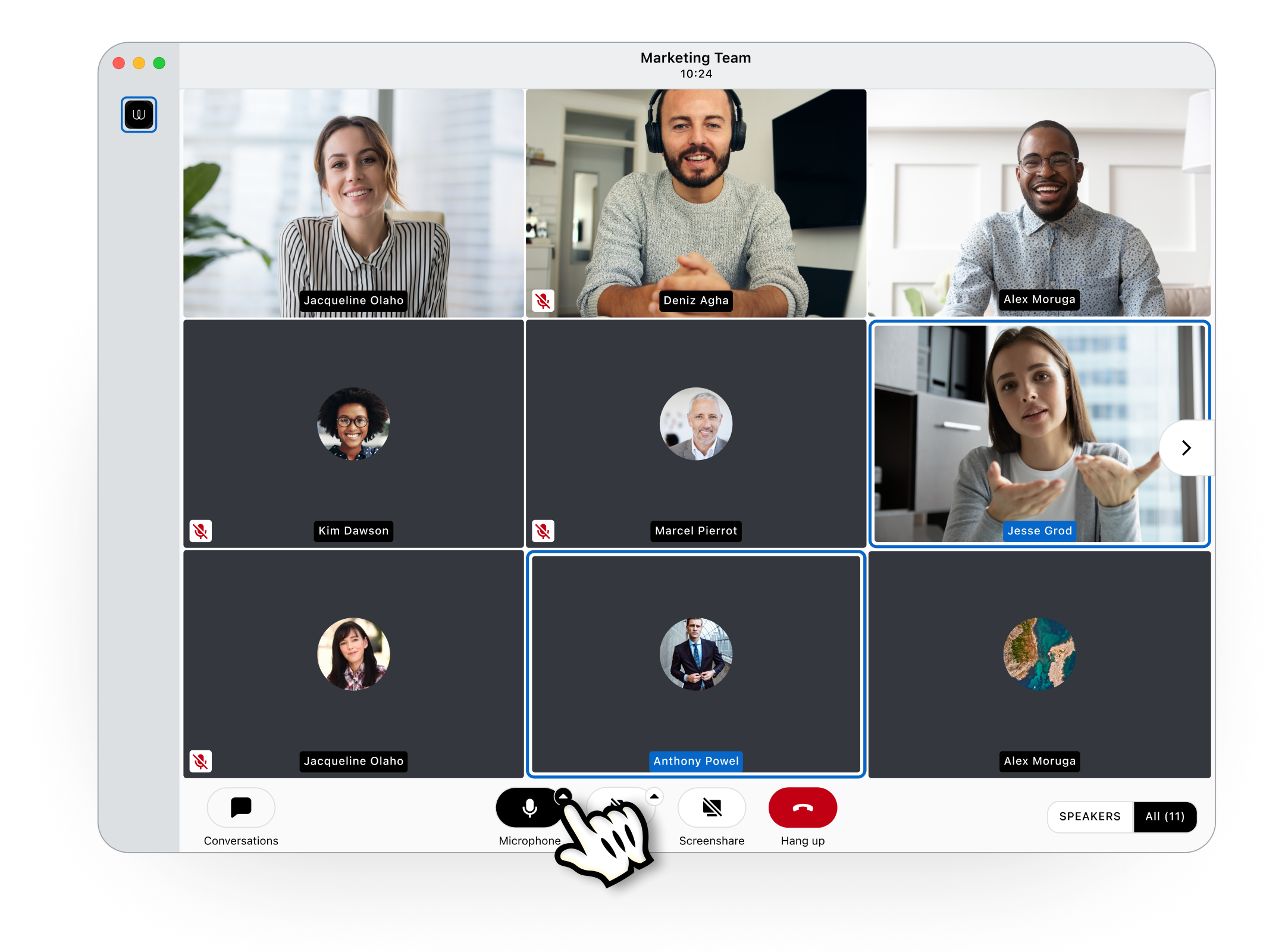
One thing that we can all agree on is that we should always work on improving ourselves. It’s in this spirit that we proudly bring to you an improved calling User Interface (UI) and a more convenient conversation view for Wire's desktop app (Windows, MacOS) and our app for your web browser. We made it easier to choose audio and visual outputs, view reactions, and conversation views. Less steps, less clicks; better communication!

Let’s get into it:
“Hello? The old UI can’t come to the phone right now.”
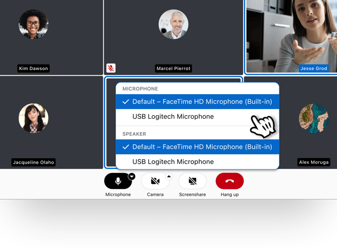
Sometimes your computer’s mic and camera just don’t cut it. Or maybe you like to showcase your inner geek with some fun, branded headphones. Either way, you can now select your preferred microphone, speaker, and camera directly during calls - without the inevitable bumbling through app settings and the awkward, “Ah hang on one second, need to switch my <device>”. Just select your preferred external hardware within the call using the small arrow to open the drop-down menu. See images below. You can still set your initial A/V device through your Wire settings. Plus, we’ve reduced the size of the bottom calling bar when in full-screen mode for an improved view, especially on smaller screens.

“Show me the receipts”
After previously adding timestamps to the sender’s name in our last update, we’ve improved the placement of the read receipts indicator. If a group admin turns read receipts on, you will find the read button (displayed as an eye icon) next to your message when hovering over a specific message. Selecting the eye icon shows you who read your message, and at what time. This tooltip view also shows message reactions. If more than two people leave the same reaction, all participants can see who reacted by selecting “show more” in the reactions tooltip. You can also see this tooltip when hovering over a message and selecting the more button (displayed as ‘...’) in the message context menu, and then Details.
“Let me upgrade you”
In other news, messages now take up the full width of the conversation views, giving you better control over how much content you want to see, regardless of monitor size (although if you’re using all 50” of your monitor for chats, respect). If you’re using high-density displays or big screens, you can adjust the size of text and UI elements in the app preferences. Wire also improved Polls and other services: buttons are better aligned for easier comprehension, and the results are also easier to read in dark mode (no timeline making it easier to read while in goblin mode though).
This update includes better interactions with code blocks and pings. We’ve implemented a new design for code blocks within Wire to make it easier to read and interact. By starting a paragraph with ``` and then a line break, the rest of the message will be differently formatted. This code block can be limited by finishing the paragraph with ``` again. And, to reduce those embarrassing moments when you accidentally ping all 500 people in your group chat, we’ve added a confirmation dialogue before pinging groups larger than 5 participants.
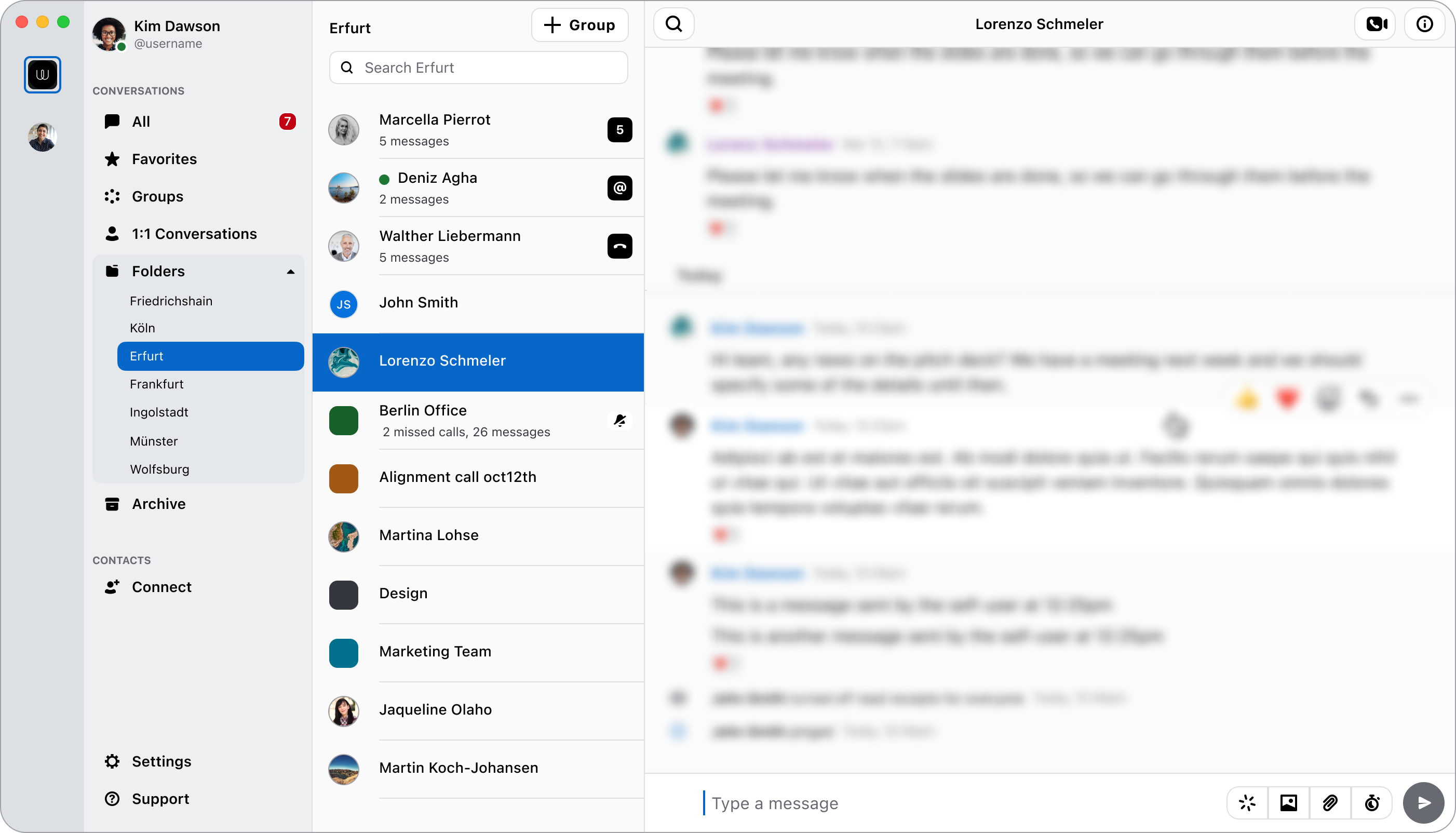
Lastly, as a sneak peak of what the Wire team is working on the the next release: navigation overhaul! This is a major change that will improve the navigation structure for a better user experience. Below you can see a teaser of what it currently looks like (subject to change). Spoiler alert: internal testers love it.

Enjoy Wire’s latest changes, and don’t forget to share with your friends and colleagues.
Feel free to reach out with any feedback.
